Hello Everyone!
We have now finished and submitted phase one of the Oxfam Headquarters project. Here is the final PDF file. It is always exciting to finish a phase in such a long process!
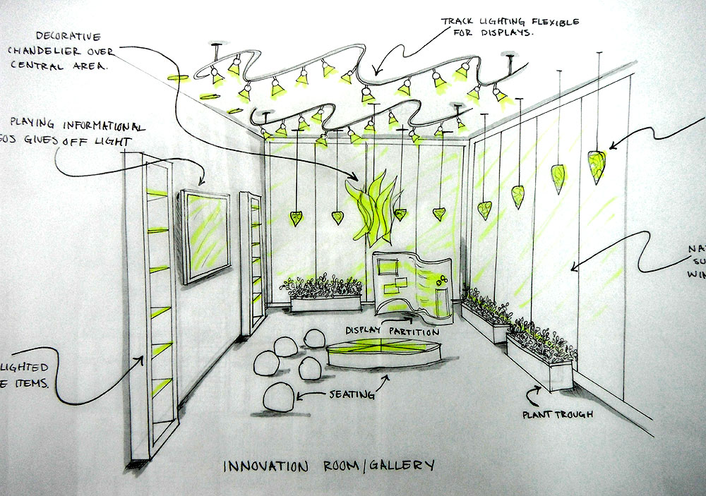
As part of the space planning and conceptualizing we had to choose and define what approximately 400 square feet of our office will be used for, and this would be a space specific to our organization. At first our idea was to have a presentation amphitheater where lectures and educational events could take place. Perhaps a week before phase one was due we decided that this was too similar to the presentation room that we are already are required to include! After collaborating, brainstorming, and of course scrapping some non-ideal solutions, we came up with what we’re calling the “Innovation Room”. This space would be used for exhibits, hands on education, and demonstrations. The idea is to have a dynamic and flexible area in which different displays can be set up for the public to experience.
This happens pretty often while defining a project, ideas or plans are invented, and then changed. The ability to remain adaptable in these kinds of situations is an extremely important skill to have. And being flexible when plans change will prevent a lot of stress!
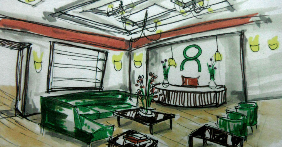
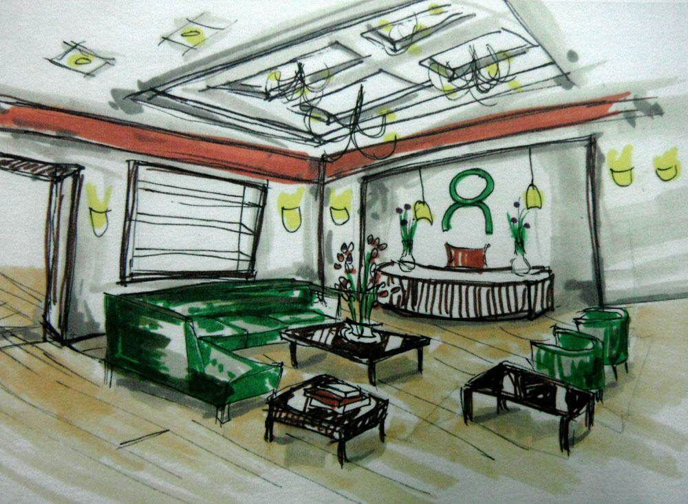
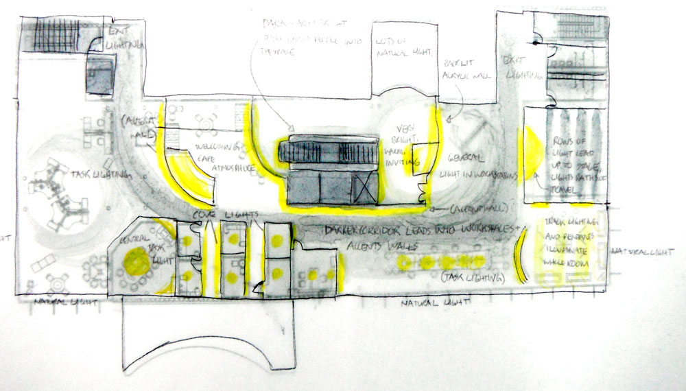
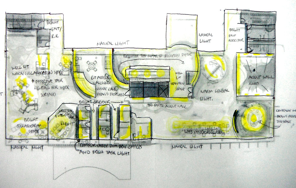
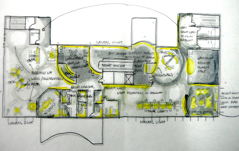
This semester everyone in our studio is also in IA 318: Lighting Design. Part of that class is the conceptualization and drafting of a lighting plan, reflected ceiling plan, and electrical plan. This year 311 and 318 are joining forces and instead of working on a completely different project for our lighting class we get to use this office design project! So far we have put together another client profile outlining needs from a lighting perspective, identified the mood wanted for different areas, identified potential problems within the space, and drawn several lighting design concepts. These concepts, I thought, were the most fun part of this initial process! Basically it is a rough interpretation of how light would interact with the space. Here we have our favorite floor plan concept, and a perspective. The yellow represents focused illumination that would accent walls, or light tasks. And then varying shades of grey just show what we would want lighter or darker within the office, based on light psychology and the client’s needs.
Now we are all busy working on different plans…check out Kate’s new post for a more detailed introduction of Phase 2!
Until next time,
Carolyn Jean Matthews
