
Hello everyone!
My name is Kate Wilfahrt. That’s Wil-FERT not Wil-FART, don’t be deceived by spelling, I’ve gotten a lot of laughs out of its German origin. I grew up not too far from Stevens Point in Oshkosh, Wis., about an hour east from Stevens Point. I am a double major pursuing my BFA in Interior Architecture and Design and a BA in Graphic Design.
I must say my parents are the major source of my inspiration and passion for design. My dad is a teacher and part-time musician and my mom a graphic designer and artist. Naturally, these artistic passions of theirs have rubbed off on me and I have enjoyed the arts since I was little. I have always been very interested in architecture, and after I gave up that childhood dream of becoming a ballerina princess I knew I wanted to focus on architecture and design.
However, when trying to select a school I was rather undecided about exactly what major I wanted to pursue. I loved architecture but also wanted to find a way to utilize even more of my creative artistic side. That is when I began to look into interior architecture and design programs around the state. I was at first a little reluctant to come to Stevens Point because is seemed small and secluded and I thought the bustle of city life would be more exciting. However, I took a leap of faith with the city and the program and I absolutely love it. The interior architecture program here is amazing! I found interior architecture to be the perfect combination of technical skill, architectural design and artistic creativity.
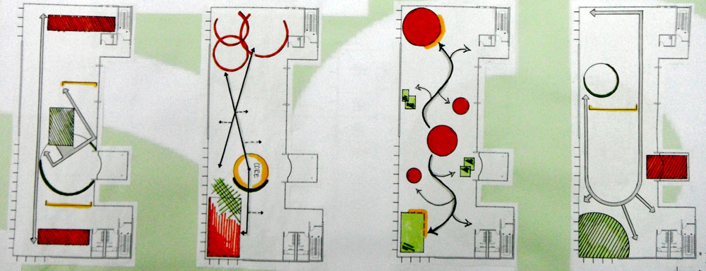
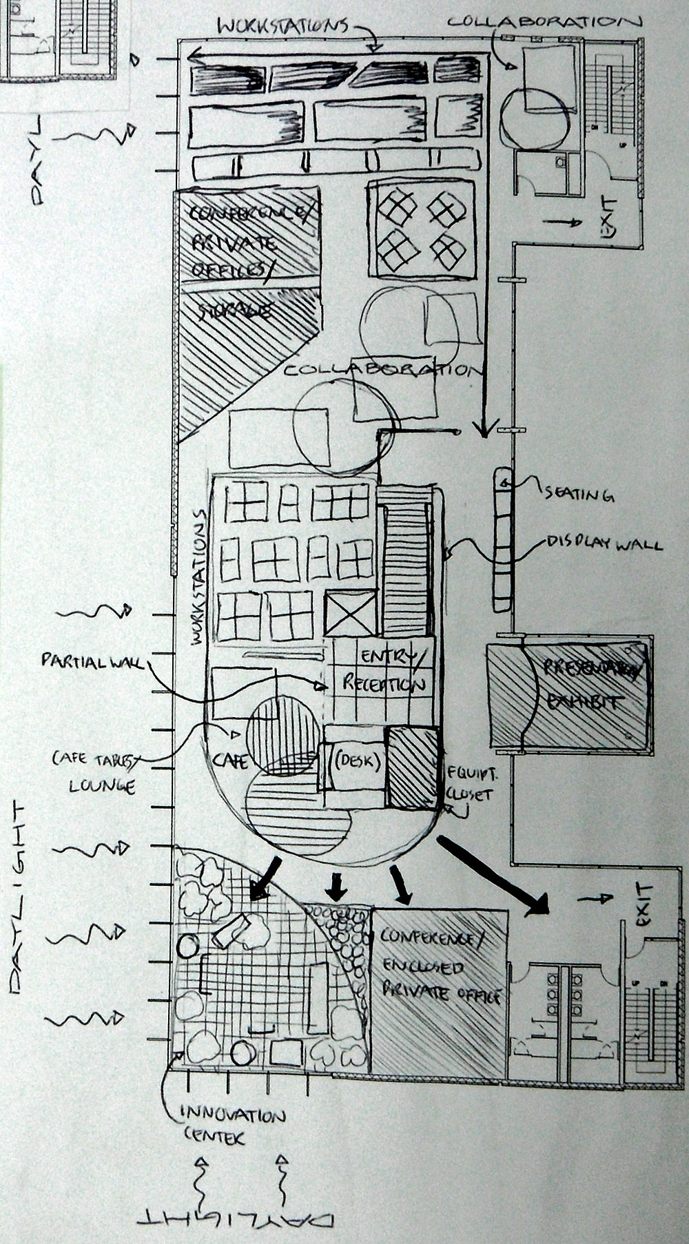
These past weeks we have begun work on phase 2 of our design project. In the first part of phase 2 we focused on brainstorming basic conceptual ideas for our spatial layout. We created 4-5 “parti” diagrams, which represent the most simplified versions of our major areas in the space and our travel paths. Next we completed 2-3 functional diagrams which are further refinements of the parti diagrams. The functional diagrams began to label our rough areas as actual rooms.
Then came out block diagrams in which we have completely given each space a specific position on the floor plan and name. In this stage we also calculate the square footage of the different areas. We add annotations or notes to our block floor plans that provide information about the relationships between spaces and circulation paths.

After we completed these planning diagrams we chose our best block diagram to begin creating our preliminary floor plan. Our preliminary plan is a rough draft of our final space. We began building walls, and built in features such as cabinets and a reception desk. We also added colored perspective sketches of different areas in the space to really bring some vision to our project.


We also started working on a rough draft of a lighting and a reflected ceiling plan. In these plans we placed a variety of light fixtures and other ceiling elements like sprinklers, ceiling tiles and vents, on the plan in the areas they work best.
We wrapped up the first part of phase 2 with rough finish and accessory selections. We chose a natural color palette of greens, neutrals, and oranges that matched Oxfam’s logo. We selected preliminary lamps, fabrics, carpets, hard surfaces, furniture pieces and office desk systems that we thought would work best for this specific work environment. We then drew up more sketches that displayed out complete vision for the space.
In the second part of phase 2 we are refining these rough draft plans to create our final plans.
Our final plans will include the following:
- Final dimensioned floor plan: our final plan consisting of only walls and built in elements. We dimension all of the walls and built in structures.
- Furniture floor plan: our final plan with walls and furniture
- Finish plan: our final furniture plan that is labeled with a key indicating which finish goes on which object.
- Reflected ceiling & lighting plan: our lighting layout finalized.
- 4 Interior elevations: we will choose 4 areas in our office to draw an elevation of to further convey what our space will look like.
- 2 Section cuts: this is as if we sliced the building in half vertically so that we can see the interior of the walls.
- Plans and axonometric drawings of 3 workspaces: these drawings are precisely measured, not a sketch, and also help to convey what the workstations will look like.
- Detail drawings of reception desk: we will be designing our own custom reception desk and producing drawings that show every side of the desk and the top. Detail drawings are used to show how something is to be built.
- Final furniture and finish selections: we must finalize the materials and furniture pieces we will be using in our office and record the information in a chart or schedule.
We include keys and annotations in all of our plans so that someone looking at them for the first time would be able to navigate the page efficiently and understand the information we have provided. It can be a lot of work to complete these plans don’t get me wrong but at the same time can be very enjoyable because at this stage the plan begins to come alive and fills us all with a sense of excitement and accomplishment.
Thanks for reading!
-Kate
