
Hello!
Today is our final work day before we have to submit phase one of our project! Right now we’re completely on schedule, with almost everything formatted. It’s always a good feeling when you don’t have to rush to meet a deadline.
The past couple of weeks we have been very busy here in our studio. Being almost finished with phase one means that we are pretty much ready to move on to schematic floor plans, and final AutoCAD drawings. But, now I’m getting ahead of myself. To reach the point of space planning a lot of ideation and conceptualization has had to happen. This semester we started by creating design guidelines.
Basically we chose five words that we thought really represented the organization, its values, and its overall themes. Our textbook, written by Roberto Rengel, describes design guidelines as being,
“used to inform programming, site selection, and design phases ofa project. The guidelines are ‘developed as patterns, design statements that describe and analyze project-related issues and suggest ways in which those issues might be resolved. The guidelines articulate shared values which will guide the development of the project’.” (Shaping Interior Space, p.126)
We refined our guidelines and the resulting document will guide us in the steps to come! (Check out the “Design Concepts and Mood Board” post for details!)
After collaborating on these guidelines we all broke off to work on different parts of phase one. The existing project conditions analyze the interior space we start with, as well as the building placement, and any other pertinent details. Space standards is a compilation of general prototype workstations that could be used in the final office. The individual and department needs list areas and square footage needed. This is also were we calculate circulation needed: percent circulation/1.0 – percent circulation = circulation multiplier. (working with 40%)
What I worked on was Adjacencies.
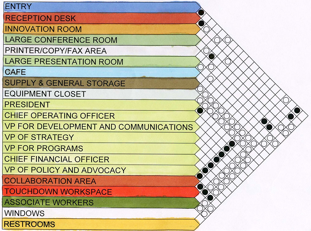
For this section of phase one I created a space adjacency matrix and two bubble diagrams. The purpose of the matrix is to organize and link different activity areas together. First I listed, broadly, the different spaces needed in our office. They are: Entry, Reception Desk, Innovation Room, Large Conference Room, Printer/Copy/Fax Area, Large Presentation Room, Café, Supply & General Storage, Equipment Closet, President, Chief Operating Officer, VP for Development and Communications, VP of Strategy, VP for Programs, Chief Financial Officer, VP of Policy and Advocacy, Collaboration Area, Touchdown Workspace, Associate Workers, Windows, and finally Restrooms.
These are the areas that we need inside the office environment. We do not simply throw a bunch of desks into a room and match the color of upholstery and carpet. As designers it is extremely important that the floor plan we finally create is one that is effective and is one that will meet our client’s needs. The restrooms need to be close to the presentation and conference rooms (for ease of access), the senior level staff need to be close to their associates and collaboration areas. The associates need to be close to a copier and fax. Etc. Etc. It would be impossible to keep track of all of these proximity requirements without help. This is where the matrix comes into play.
Here is my final product, color coded to match the eventual bubble diagrams:
The black dot represents primary adjacency and the white dot represents secondary adjacency.
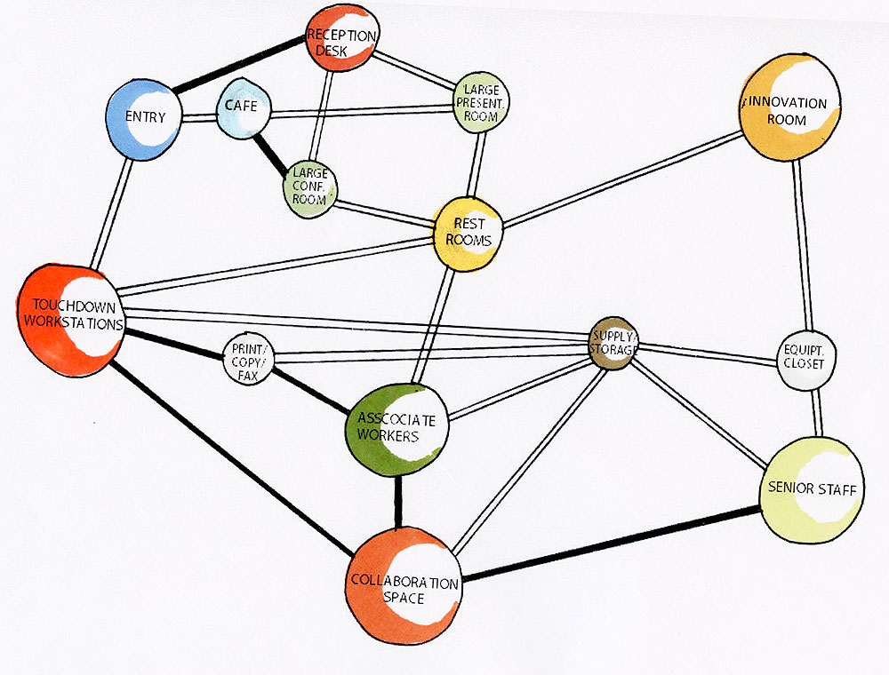
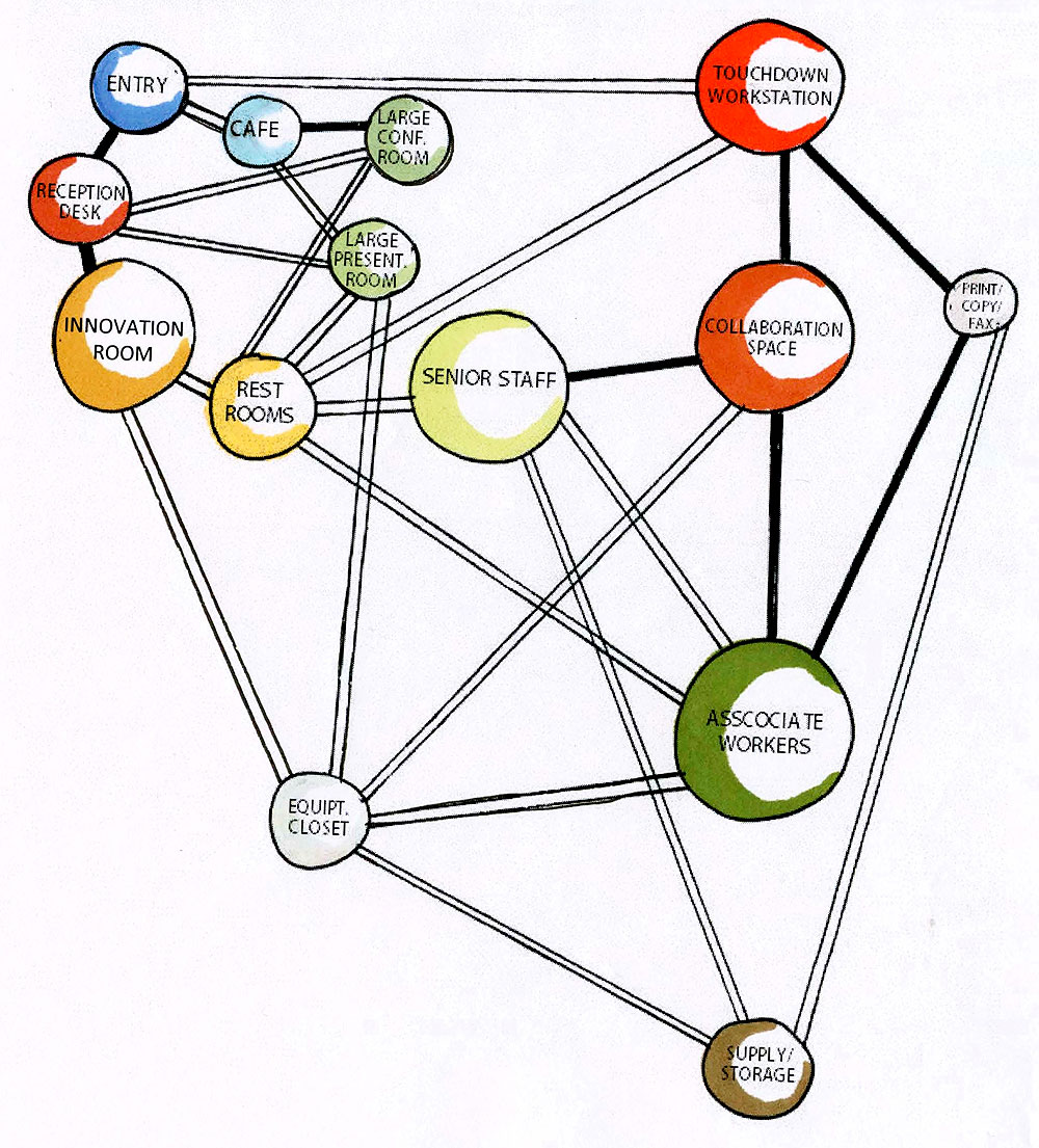
When we start putting these areas into the actual floor plan this is a huge help! Using this matrix I created two different bubble diagrams. These diagrams use the same data as the matrix, and the same visual connections (black and white lines), to represent our space in an abstract way. In these diagrams no other line can cross a primary adjacency, but secondary adjacencies can cross each other as much as they want.
I drew the matrix in AutoCAD, exported it as a PDF file, printed that, rendered it with prismacolor/chartpak markers, and scanned it back in as a JPEG.
For the bubble diagrams I started by drawing it freehand with pencil until I found an arrangement that worked, then I did a final in pen, scanned that, put it into PPT, added text, printed, rendered, and finally scanned it back into the computer.
Check out Joslyn’s post to read about how we came up with our concept and to see our final mood board!
Thanks for reading!
Carolyn Jean Matthews

